This is the rebranding project. The task was to create new powerful brand identity for a young but rapidly developing engineering company that offers unique solutions for oil and gas companies.
The main goal of the company is to change the oil and gas engineering market: to get away from outdated approaches and methods, to introduce modern solutions and technologies into engineering practice. On the other hand, the company respects the history of the industry and its origins, because without the past there would be no future.
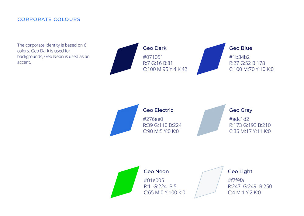
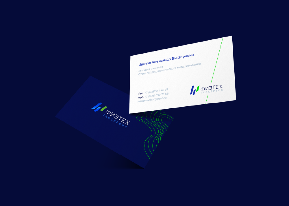
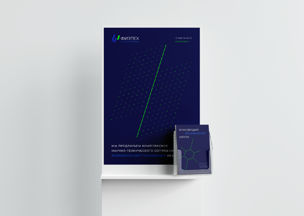
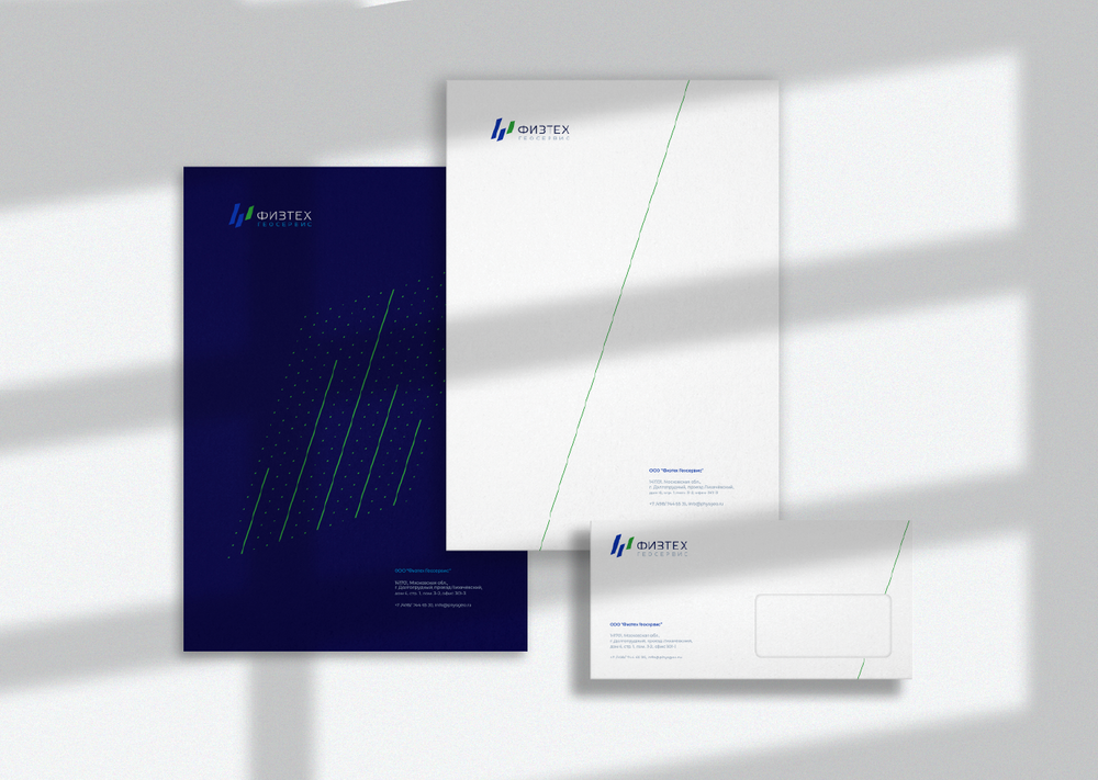
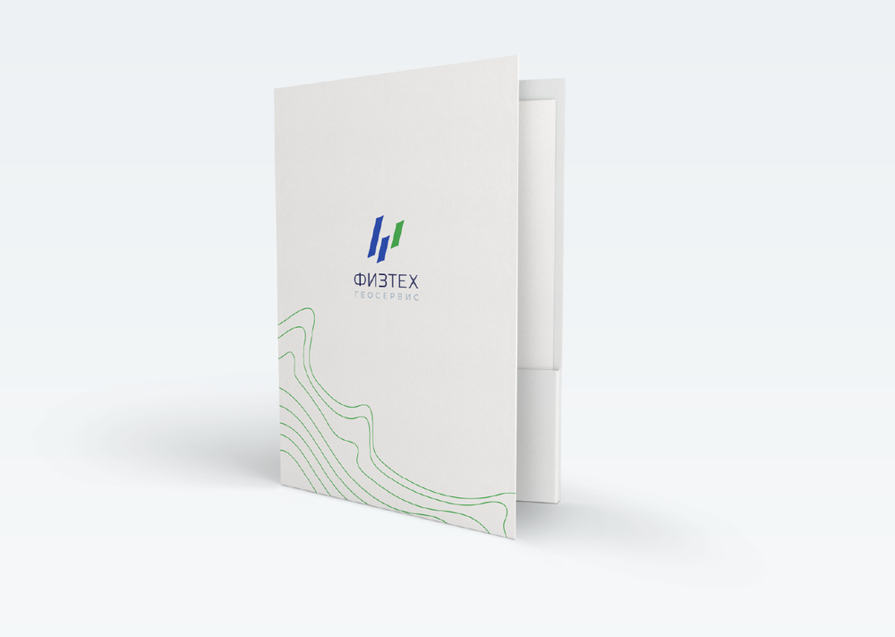
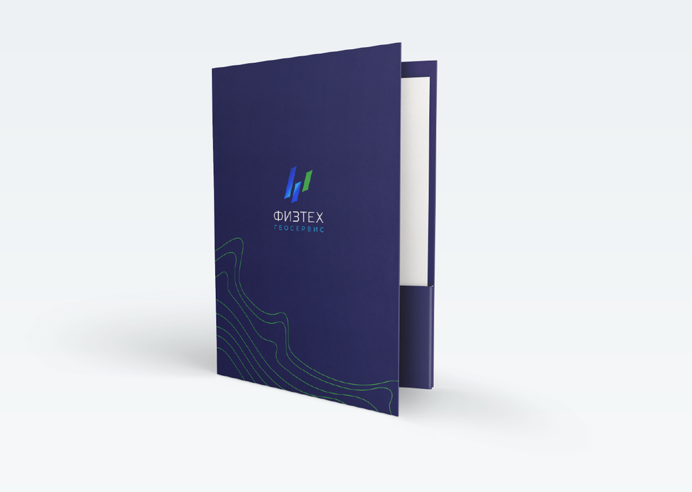
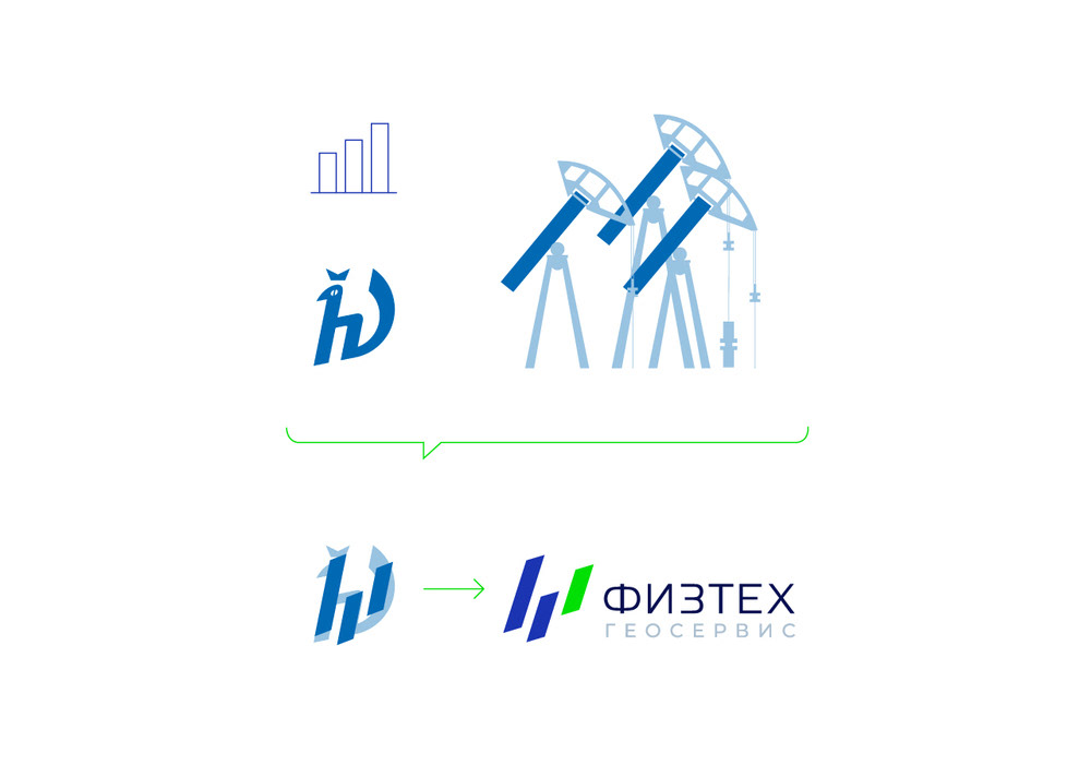
These ideas are incorporated into the logo and corporate identity. The image of three pumping units, as a classic symbol of the oil industry, is transformed into three dynamic stripes that reflect development, rapid growth, innovation, as well as the graphics and data with which they work, as they are engaged in software production and analytics.
The company values its origin, which is why the sign contains a reference to the mascot of the Moscow Institute of Physics and Technology (hν), from which they grew up. The employees of the company know that in the logo appeared from hν (the energy and momentum of a photon) and are proud of it. Additional graphics used in visual identity were created based on real processes and visualizations of oil and gas projects.